
FORM BEST PRACTICES
The Ultimate Guide to Web Forms
Expert advice and strategies for designing, building, connecting, and securing your web forms
What is a web form?
A web form is an online page that collects structured data from a respondent, such as contact details, payments, applications, or survey answers. Every effective web form shares four elements: input fields, a clean single-column layout, consistent branding, and clear content.
Getting started with web forms
Whether you’re just starting with web forms or want advice on how to optimize them for your organization, you’ve come to the right place. This guide taps into the collective wisdom of our customers who’ve launched over 900,000 web forms. Discover their insights, best practices, and expert tips in this ultimate form-building guide. In this guide, you’ll find everything you need to know about how to create a web form, the basics of form design, ensuring secure web forms, common form mistakes to avoid, and much more.
Find what you’re looking for
- Overview: What Are Web Forms?
- Most Important Elements of Web Forms
- How to Create a Web Form
- Web Form Building Classes
- Common Web Form Examples
- Web Form Mistakes to Avoid
- Form Design Best Practices
- Connecting Forms to Other Applications
- Web Form Security Best Practices
- Start Building High-Quality Web Forms
Why you need web forms
No matter your organization or industry, you need an efficient way to collect data from individuals. Web forms are the ideal tool for collecting all types of data, and have nearly endless uses, including:
- Contact and lead generation
- Online donations
- Onboarding and intake processes
- Applications and registration
- Surveys and customer feedback
- Orders and payments
- Support requests
Web forms are the primary way to collect high-quality data that your organization can use to communicate with prospects and customers, make informed decisions, improve processes, and ultimately increase revenue.
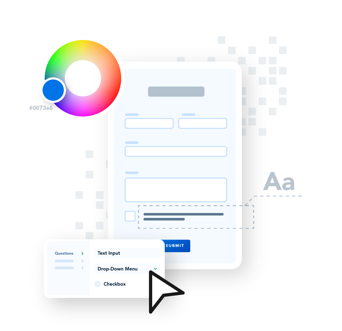
The four most important elements of web forms
All optimized web forms have the same elements: input fields, clean layout, branding, and clear wording. The goal of your web form is to gather accurate and useful data from a respondent. To ensure good usability, your forms should contain these components:
Input Fields: Text fields, check boxes, radio buttons, text areas, and other fields that will collect names, passwords, payment data, feedback, and more. These fields may need to be required or have validation, depending on the type of data you’re collecting.
Clean Layout: The structure of the form, including logical order of input fields, grouping related fields, and single-column format. The layout of your form is critical for ensuring it is user-friendly and easy to navigate as well as being mobile optimized.
Branding: Colors, fonts, and logos that signify the form is related to your organization and blend seamlessly with the design elements on your website. Be sure your form considers accessibility.
Content: Useful labels that tell the purpose of the field, logical instructions, helpful error messages, and clear CTA button text. The wording on your form should be clear and follow your messaging guidelines.
How to create a web form
How you create your web form directly impacts the number of submissions you receive. Being purposeful in both your form’s construction and its objectives gives you better results.
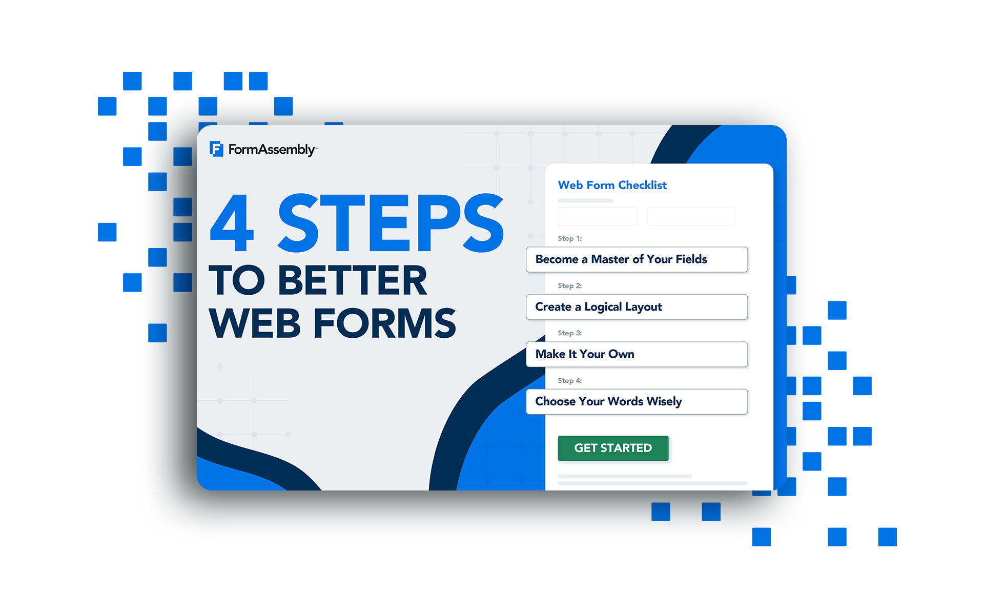
Create web forms that increase trust and boost conversions
4 Steps to Better Web Forms
Form building classes
Learn the basics of how to create, connect, and secure your web forms with FormAssembly in this series of webinars.

Focus on the Form
How to create and brand web forms for a seamless user experience.
WATCH
Connected Forms
How to connect forms and get your data where it needs to go.
WATCH
Secure Form Foundations
How to stay compliant while collecting sensitive personal data.
WATCHCommon web form examples
Most likely, you will need to create multiple web forms to meet the data collection requirements of your organization. Each of these web forms will have common elements but will have different purposes, requiring you to structure them differently. The following best practices will help you optimize each of these forms, so you can keep users engaged, increase lead conversions, and collect the high-quality data you need.
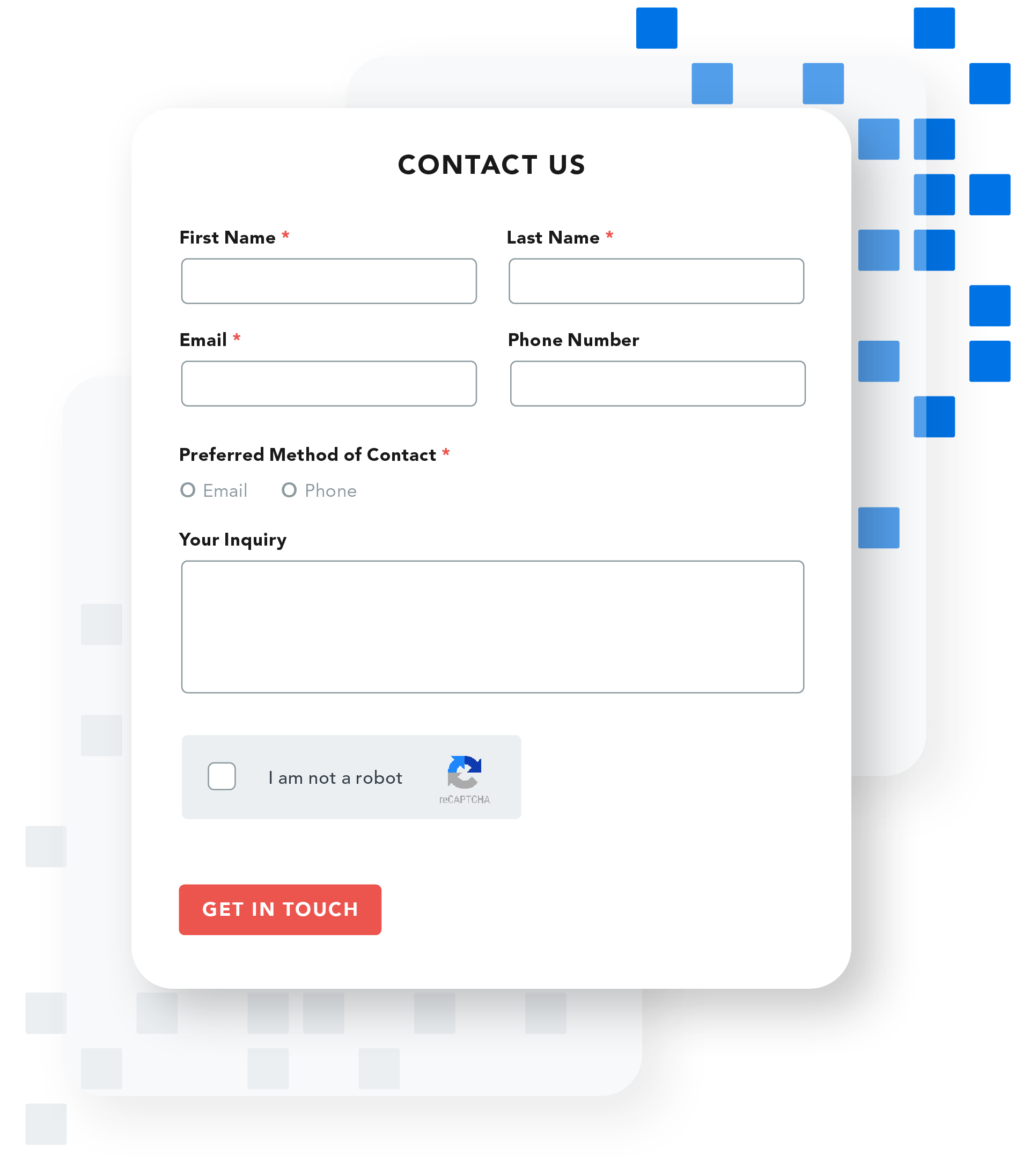
Lead generation forms
Lead generation or contact forms are effective tools to engage customers and prospects, and serve a variety of purposes including demo requests, new trial signups, sales inquiries, feedback, and support.
Pro tips
- Include input validation. For example, you may require an email address or phone number, and you’ll want to make sure that data is input in a certain format.
- Keep it short and to the point. This will increase the likelihood a respondent will complete the form.
- Use a text box to let users explain why they’re reaching out.
- Give it a personal touch. Consider adding images of your real team so they know who they can expect to hear from.
- Get creative with your CTA. “Get in Touch,” “Connect with Our Sales Team,” or “Contact Support” are great alternatives to “Submit.”
- Add reCAPTCHA to prevent spam.
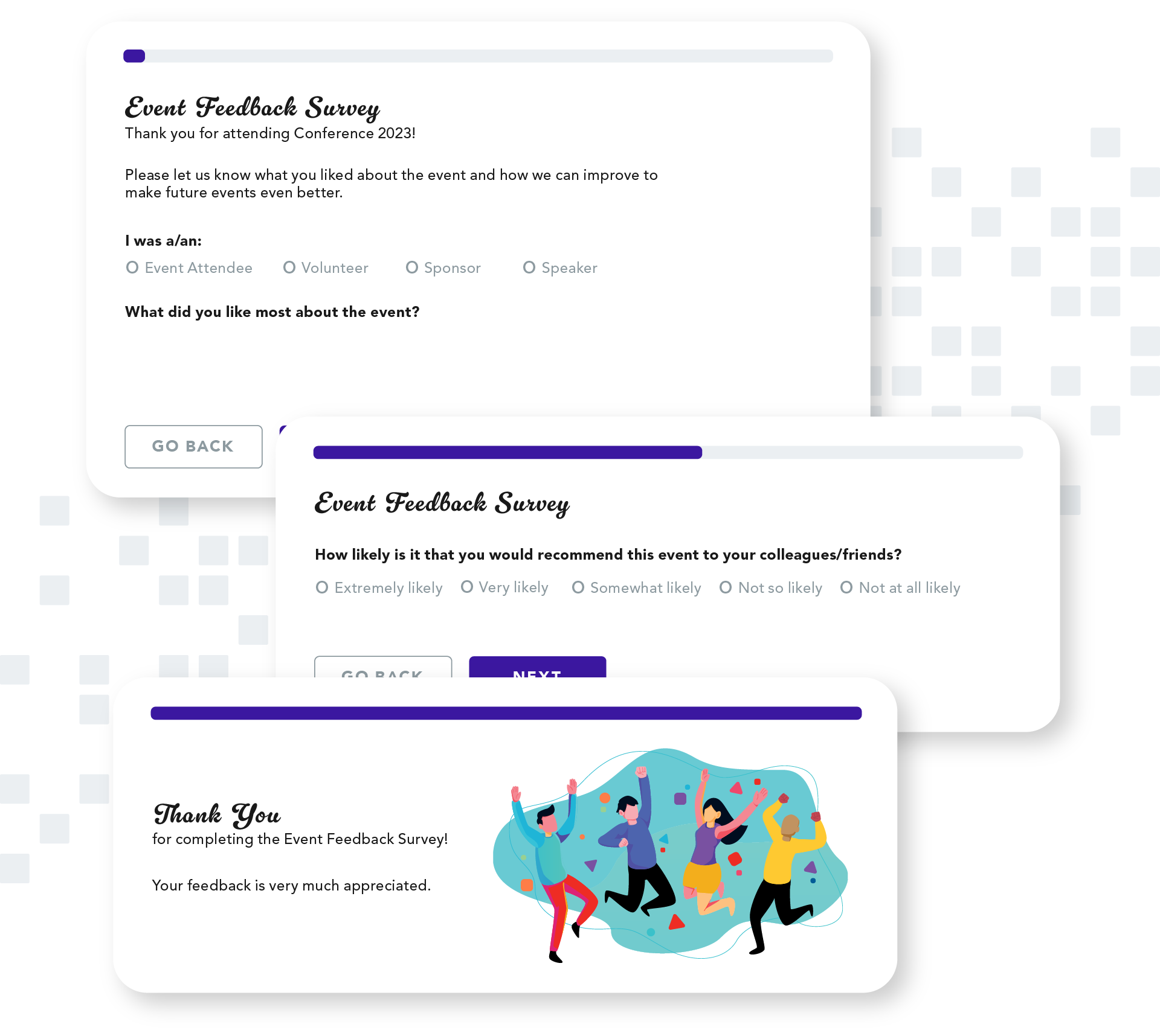
Survey forms
Surveys are versatile tools you can use to gather both internal and external feedback, providing valuable insights on topics like customer satisfaction, market research, and product development.
Pro tips
- Customize your questions to your target audience.
- Vary field types to encourage participation.
- Show appreciation for completing your survey. A simple “thank you” can go a long way.
- Include a field for an net promoter score (NPS) or customer satisfaction (CSAT) score to track user feedback over time.
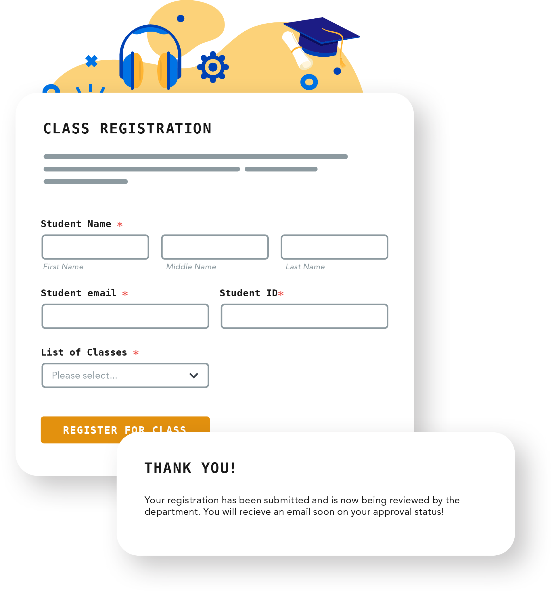
Registration forms
Registration forms are a great way to gather data for a wide range of purposes, including one-time events, classes, memberships, volunteer opportunities, and creating new accounts.
Pro tips
- State the benefits of a user registering.
- Only collect data relevant to the purpose. You can always follow up if you have any additional questions.
- Use a data masking feature to keep sensitive data like SSNs or credit card numbers secure.
- Be clear about the next steps and what to expect. For example, is their registration automatically accepted or is it pending approval?
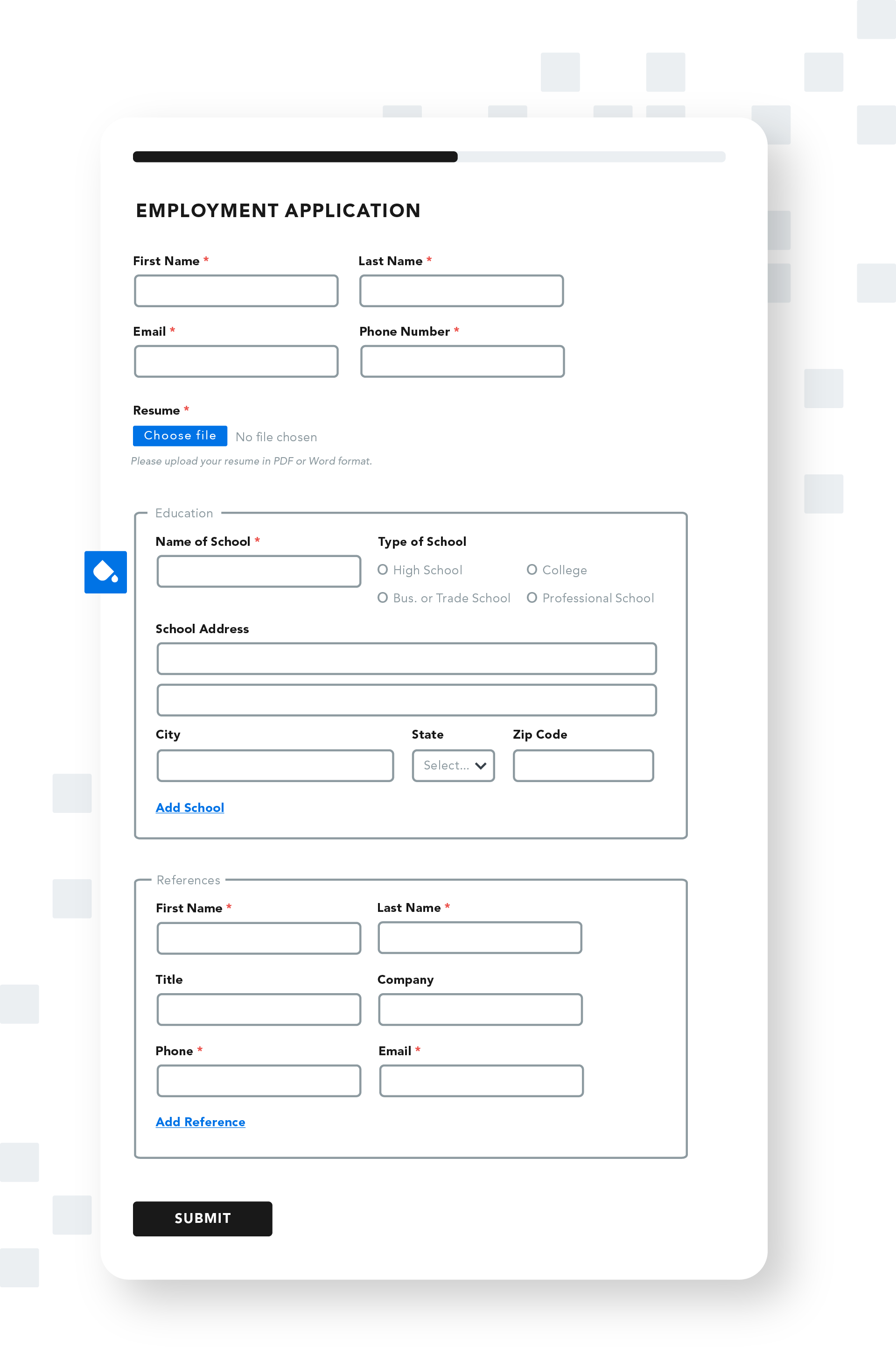
Application forms
Applications are an effective way to gather important details such as documents, contact and payment information, and qualifications from individuals interested in jobs, loans, or programs.
Pro tips
- Be aware of laws or regulations related to your industry or region regarding what you can and cannot ask on an employment application.
- Use form pre-fill to avoid making applicants re-submit information. For example, you don’t want applicants to have to re-enter all of the information that’s on their resume.
- Use progress indicators or break long applications into multiple pages.
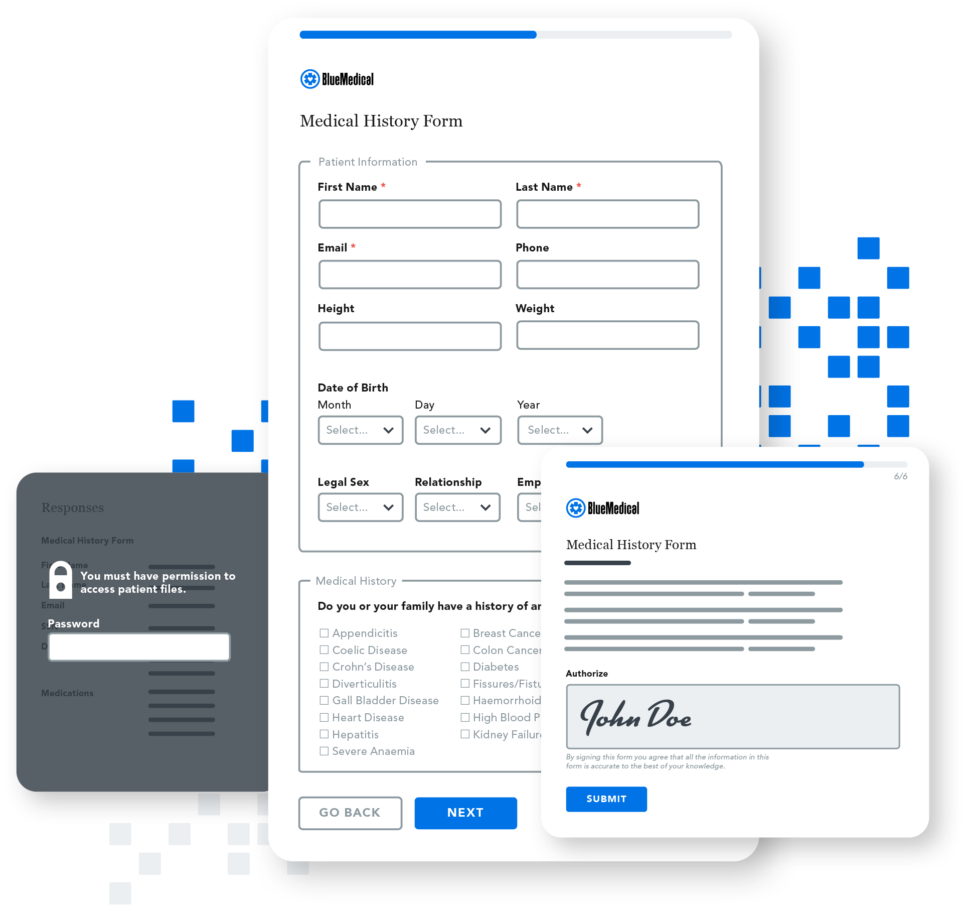
Intake forms
Intake forms simplify the process of collecting personal and health information, insurance, and contact details from patients who can complete and submit an online form before visiting the office.
Pro tips
- Focus on compliance. Complying with HIPAA and any other relevant laws and regulations must be your top priority.
- Stick to a simple layout, and consider adding a progress bar if it is a multi-page form.
- Use conditional logic to streamline form filling.
- Enable e-signature for signing forms or releases.
- Keep branding (including your logo, colors, and fonts) consistent to build trust.
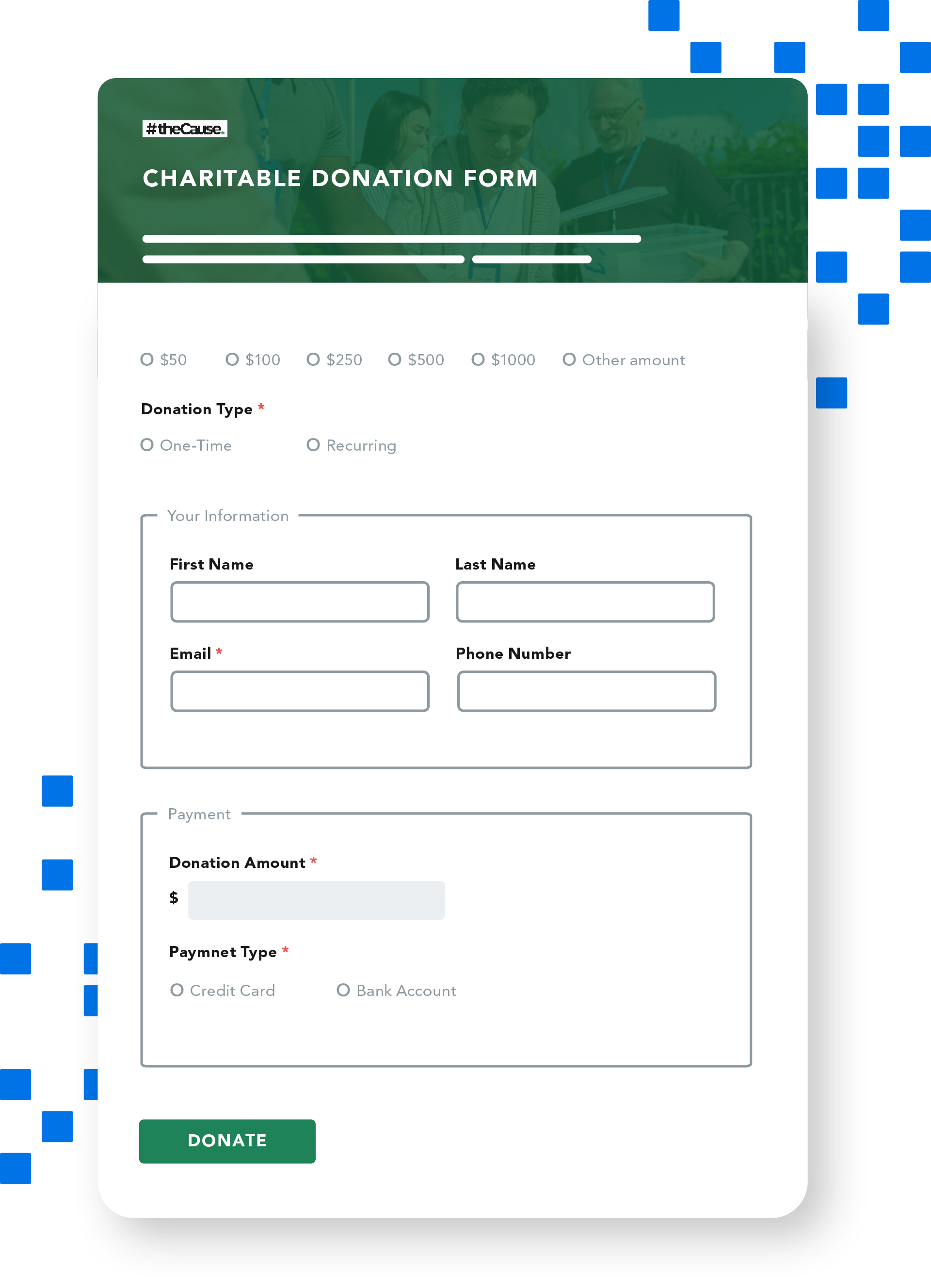
Donation forms
Donation forms provide a user-friendly and straightforward way for donors to submit one-time or recurring donations online.
Pro tips
- Keep copy minimal, but reemphasize your mission to remind users their donation is going toward a good cause.
- Ensure you capture email as part of a user’s contact data so you can send them a receipt for taxes and stay in touch.
- Allow your donors to easily set up recurring donations.
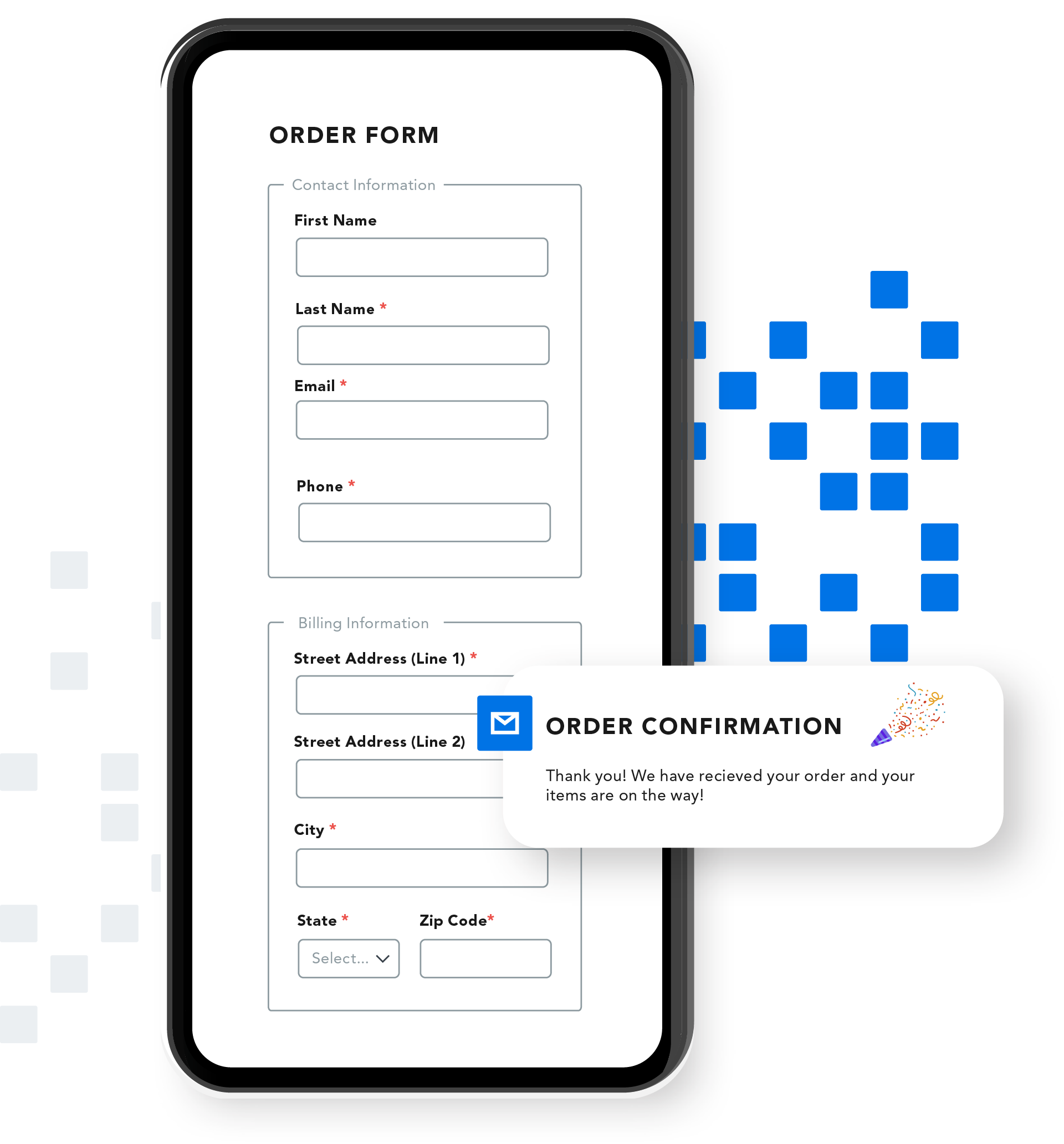
Order forms
Order forms are a secure and convenient way for customers to purchase products and services online. These forms contain fields like product options, quantities, and customer data.
Pro tips
- Adhere to data security best practices and comply with any laws and regulations for handling credit card information like PCI DSS.
- Return explicit error messages if there’s a problem with the order.
- Provide a confirmation number once an order is submitted.
- Be sure order forms are mobile responsive for users accessing from their smartphone.
- Test your payment connectors regularly.
5 web form mistakes to avoid
While many web form mistakes are common, it doesn’t mean you have to make them yourself. Familiarize yourself with the information below, so you can avoid these errors when creating your own forms.
- Asking for too much information. Only collect the data you need to fulfill the purpose of your form. This is both a user experience and a data security best practice. The less data you have, the less chances it will be lost or leaked.
- Poor formatting and layout. Keep your layout clean and in a single-column format, with plenty of space between field-label pairs. A good form flow should also organize input fields from easiest to most difficult to fill out.
- Lack of branding. Forms that do not match your organization’s brand colors and font will look spammy and cause confusion or distrust with respondents. Always incorporate your brand elements into a form unless they don’t meet accessibility guidelines.
- Confusing errors and messages. Not being direct and providing clear instructions when an error occurs will frustrate respondents and could lead to form abandonment. Always display error messages near the field with an input issue and provide real-time feedback.
- Poor security measures. Forms that do not comply with security, privacy, and compliance requirements put your organization at risk. Be sure you know what regulations apply to your organization and that you are handling data properly.

Get all the form-building best practices, all in one place
Web form design best practices
Knowing how to create a web form is just as important as knowing what not to do. Your web forms should be easy for respondents to navigate, but also gather the data you need. Thankfully, this process isn’t as fine a balancing act as it sounds if you know form design best practices.
Tip 1: Stay focused on the goal
Know who your web form is targeting and why you need to collect data. For example, a Contact Us form and a university application form will have different goals and require different form fields. Stay focused on the goal of your form and only collect the information you need.
Tip 2: Organize form fields logically
Forms are easier to fill out when information is grouped logically, such as personal information or payment information. A logical layout will give your respondents easy “wins” that can make it more likely for them to continue filling out your form. If you have longer or more complex web forms, ease your respondents into the process by ordering your fields from easiest (e.g. name) to hardest (e.g. payment information).
Tip 3: Stick to a one-column layout
A single-column form layout is easier to navigate and fill out, especially on a mobile device. One-column layouts make it less likely that a respondent will miss a field and cause an error or give you incomplete data. If you have longer, more complicated web forms, breaking these forms into multiple pages makes it easier for respondents to complete. Adding a progress bar or save-and-resume feature will also help keep users engaged and on track.
Tip 4: Use real-time field validation
Data input errors happen. Keep your respondents engaged by providing in-line validation or error messages in real time. Giving an immediate response if an error occurs allows a user to fix their mistake right away. This better ensures that a user will complete and submit your web form, and that you are collecting accurate data.
Tip 5: Keep error messages clear
Confusing or negative error messages will only add frustration for respondents.. For example, instead of messages that simply say “a field is incorrect” or say “you didn’t fill out your email correctly,” provide clear and positive feedback. The more positive the experience, even when there is an error, the easier it will be for a user to complete your web form.
Tip 6: Pre-fill known respondent data
If a respondent has already filled out a web form on your site, be sure to pre-fill this information when they fill out a different form. Pre-filling provides a better user experience for your respondents by giving them less fields to complete. It also shows that you are properly collecting and managing their data on the backend. See how easy it is using the FormAssembly Data Collection Platform and Salesforce Connector.

Connecting forms to other applications
Building a form is just the beginning. If you’re creating a web form, chances are you need to connect this form to other business applications. Forms that integrate with other tools such as your CRM or a payment processor will help streamline your data collection processes, improve efficiency, and reduce manual work for your team.
CRMs (Salesforce)
Connecting a web form to a CRM like Salesforce makes sure the data you’re collecting goes directly into your system of record without any manual uploads. The more comprehensive a Salesforce integration is, the less time you’ll need to spend fixing data errors or updating old records.
→ Learn more about FormAssembly’s Salesforce integration
Payment processors
Collecting payments through your web forms can be a complicated process without the right integrations. If your forms can connect to payment systems such as Stripe or PayPal, you’ll be able to easily accept one time or recurring payments from respondents. Payment processor integrations also improve user experiences by providing a secure and frictionless process.
→ Learn more about FormAssembly’s payment processors
Spreadsheets
If you manage data using Google Sheets or Microsoft Excel, having an integration that can automatically move data from your web forms to these spreadsheets can save you hours in manual work. Automatic data transfers mean no more manually exporting and importing CSVs. A Google Sheets or Microsoft Excel integration also helps to reduce data errors and the risk of sending or sharing sensitive information with unauthorized individuals.
→ Learn about FormAssembly’s Microsoft Excel connector
Learn how to connect your web forms and improve data flow

4 web form security best practices
Depending on your organization’s needs, you may be required to collect sensitive data through web forms, such as passwords, financial, and medical information. In such situations, your web forms must conform to industry-specific compliance regulations associated with the type of data you are handling. A few best practices to build security into your web forms include:
1. Data minimization
When creating a web form, first make sure you understand the form’s intended purpose. This will help you only collect essential and relevant data. Do not store the data longer than necessary to complete the intended action.
2. Secure file scan
To prevent malicious files from entering your database via a web form, implement antivirus file scanning. This type of feature can flag incoming files as either safe or suspicious, so you catch malware before it causes damage.
3. Field validation
Field validation can help prevent spam and code injection in your web forms. This could involve setting parameters for each form field’s accepted data type and configuring a field to only accept relevant symbols or numbers.
4. Data encryption
Data encryption in transit and at rest is crucial for safeguarding sensitive information. By converting original data into unintelligible ciphertext, you can protect confidential information from unauthorized access.