
Let’s face it: spending time to build a donation form, feedback form, or survey can be frustrating when your form conversion rate is low. The entire goal of most, if not all forms is to gather responses. So, why are your respondents not filling out your forms as planned?
Unfortunately, there’s no simple answer to the low form conversion rate question. Everyone has their own reasons for not making it to the end of a form, and some of the reasons might have nothing to do with how well your form is designed. (Although you should always make sure you’re following best practices when it comes to design and function.)
While you can’t read the minds of your respondents, there are a few things you can do to increase your form conversion rate.
1. Decrease the number of form fields strategically
It seems like a no-brainer, right? Limiting the amount of fields in your form makes it easier to fill out, which can therefore increase your form conversion rate. Not only is this step logical, but there’s plenty of data to back it up. Here are a few examples:
- Hubspot’s Dan Zarella looked at more than 40,000 landing page results and found that as text areas (text form fields that are sized for larger amounts of text) increase, there is an associated drop in conversion rates. Zarella found that using one text area led to a conversion rate of about 20%, but using up to five text areas dropped conversion to below 10%. Using numerous drop-down fields may also be limiting your form conversion rate.
- Eloqua conducted research on the connection between the number of form fields and landing page conversion rates. In an analysis of 1,500 landing pages, they found that fewer form fields leads to higher return.
- Imagescape saw a 120% jump in their form conversion rate after they eliminated eight form fields on their forms, bringing the total number of form fields down to just four.
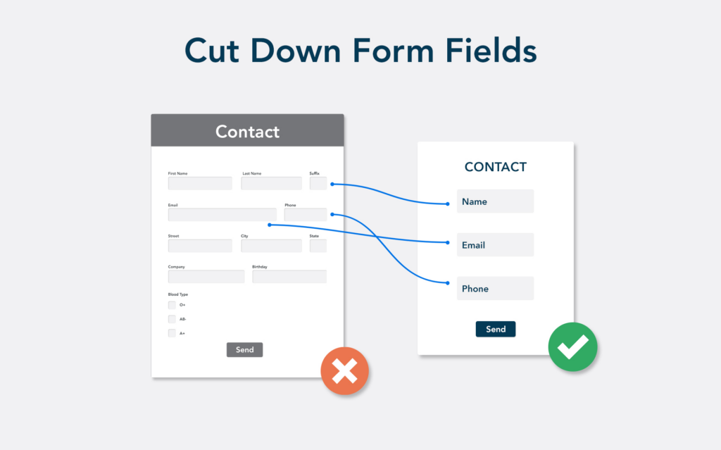
2. Remove unnecessary form fields
If you take a look at your longest web form, chances are that you might have some unnecessary fields throughout the form. To increase your form conversion rate, you may want to rethink the way your form is structured. Even if you’re creating a complex form that needs a higher number of fields, it’s still possible to make it easier to fill out.
When you’re deciding which form field should stay or go, here are some things to consider:
- Ask for essential information only. If you’re capturing lead information, you may not actually need your respondent’s address. If this is the case, consider leaving that field off the form altogether. The same rule applies for telephone, age, and birthday fields. In fact, one study shows that phone number fields decrease conversion by as much as 48%. If possible, remove these and any other non-essential pieces of information.
- Don’t confuse your respondents. Make sure that you are clearly specifying the exact bits of information you need from your respondents. If some fields require more context, add hints or explanatory text to help the respondent understand precisely what they need to provide.
- Clearly mark required and non-required fields. Research from the Baymard Institute says it’s useful to clearly delineate which fields are optional while also noting which fields are required. Taking the time to define both types of fields helps users progress through forms with ease, thus increasing your conversion rate. The research shows that this is especially true in the realm of e-commerce forms.
3. Focus on the form’s value to your audience
Asking someone to fill out a form can be a tall order. Even though it may only take a few minutes to enter some personal information and leave a few comments, you’re still asking something of people you probably don’t know very well. (Unfortunately, many users are also leery of sharing their personal information.) Because of these factors, you need to offer your audience something of value in return for their time and information.
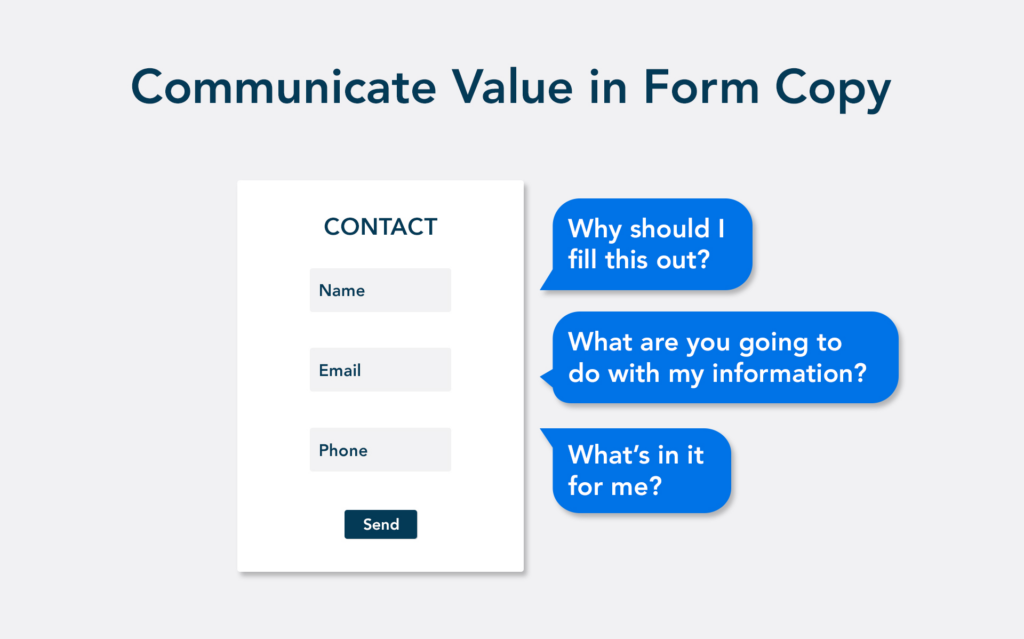
With just about any form, there’s a benefit to the user if they choose to finish and submit it. The key is to communicate that value up front, while also reassuring them that their data is secure. Here are a few examples of this:
- State your cause. If you’re collecting donations for a nonprofit organization, make sure to clearly explain the purpose and significance of your respondents’ donations. People will be more likely to donate if they understand and believe in the cause. Also, make sure to use a secure payment processor to keep payment information safe as possible.
- Keep it simple. Too often, job applications are painfully long and tedious, but they don’t have to be. Eliminate stress by creating a simple process for applicants that reflects your company’s brand and mission.
- Give your respondent something useful. The idea of exchange is a well-known tenet of content marketing. You give your users something of value in the form of helpful content, like an eBook or infographic, and in return, they give you their lead information.
4. Make forms easy to fill out
Although the ideal form might be short and sweet, there are plenty of use cases that require longer forms. Job applications, certification processes, and admissions applications may include more form fields and take a bit longer to complete. While this is hard to avoid in some use cases, there are still some ways that you can leverage FormAssembly to help increase your form conversion rate.
- Prefilling: Already have a form user’s information in your CRM? Use a prefill function to enter certain information so they don’t have to.
- Multi-Page Forms: If your form involves multiple sections and lot of scrolling, consider breaking it up between multiple pages.
- Save & Resume: Some forms are just too long or complicated to finish in one sitting. Allow them to save their progress and continue filling out the form when they’re ready.

If you’re not seeing as many form submissions as you’d like, whether it’s a sudden drop-off or a slow decline, try some of these practices to increase your form conversion rate. Tune in to this episode to create the perfect conditions for high performance web forms.