
Making sure your users are engaged as they fill out a simple contact form on your site is one thing. But what happens when you have more complicated forms with lots of different steps and fields? You need to find a balance between collecting essential information and ensuring a seamless user experience. And a great way to do this is with a multi-step form.
A multi-step form helps simplify the process by breaking down the complexity of long forms into small, manageable steps. This prevents users from feeling overwhelmed and makes the overall experience stress-free.
There are several ways you can make sure your multi-step form follows best practices to keep users engaged, including save and resume, clear error handling, and purposeful UX design. Learn about these best practices, real-world examples, and multi-form fumbles to avoid.
Save and resume: enhancing user flexibility
If your form is long and complex, such as for a job or loan application, a respondent may not be able to complete your form in one session. Without save-and-resume, you may end up with many forms left incomplete. This will only frustrate respondents and won’t give you the data you need.
Offering a save-and-resume option on your multi-step form is a great way to keep users from feeling intimidated. A save-and-resume option can also give respondents peace of mind that progress will not be lost if they need to pause and come back later.
Respondents will be able to pick up right where they left off, increasing the chances they’ll complete your form and you will collect valuable information.
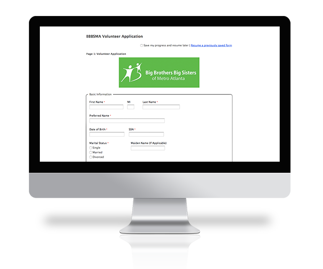
Big Brothers Big Sisters of Lone Star added a save and resume feature to their volunteer application form. Providing this option lets users save progress and resume later, or resume a previously saved application.
Clear error handling: guiding users to fix mistakes
Over 67% of respondents will abandon and never complete your form if they encounter any complications. And a long, complex form, even if it is a multi step form, can have complications.
Imagine getting to the end of an 8-page form and hitting submit, only to be alerted that you made an error on page 2. There’s no save option and no way to jump pages. You have to manually backtrack to fix the error before manually clicking through to the end.
Instead of the back-and-forth hassle, offer real-time validation to alert respondents the moment they make a mistake on your form. Make sure your error messages are also clear. Keep error messages close to the field in question.
Provide informative and concise error feedback that makes it obvious where a respondent needs to make a correction.
Ivy Tech Community College offers clear and direct error messaging, highlighting both the field and the page of the application in red, so students can fix their mistakes before submitting the application.

Form design: preventing overwhelm with better UX
According to Hubspot, forms with an average of 5 fields have the highest conversion rates. Of course, your multi-step form will most likely have significantly more fields. Even if you break your form into multiple steps, if each step contains many form fields, your respondents may still get overwhelmed.
To maintain user engagement and reduce overwhelm, design your multi-step form to have no more than 5 form fields in each step. From a user experience perspective, grouping each step by topic (such as contact information or payment information) will make logical sense to respondents.
A good practice for keeping users engaged is by using conditional logic in your forms. A conditional step will keep form fields hidden unless a respondent makes a specific selection on a field. For a multi-step form, this will help users keep momentum by not requiring them to fill out fields that are irrelevant to them.
3 Form UX and aesthetic suggestions
If you’re new to designing web forms or UX design, here are a few tips that will help as you build your multi-step form.
- Use visual hierarchy: Don’t overload your forms with too many design elements that all compete with each other. Instead, design your form in a natural progression so as not to confuse your respondents.
- Integrate brand elements strategically: If your brand has a script font or other more creative elements, refrain from using these throughout your form. You can still showcase your branding, but to keep your form accessible, use clean fonts and minimal colors.
- Include clear, descriptive labels: Avoid confusing respondents with ambiguous labels by being clear and descriptive. By telling a user exactly what action they need to take or how to format their response, you’ll be more likely to get the quality data you need.
Real-world examples: best practices in action
1 – Form UX: HelloFresh

What we liked
- Detailed instructions that keep users engaged.
- Visual hierarchy that draws the user from left to right.
- Clear steps and progress indicators.
2 – State Farm: error handling

What we liked
- Specific and real-time error messages with clear directions on how you can fix the error.
- Errors that require fixing before moving on to the next step.
3 – Facebook marketplace listing: floating labels instead of placeholder text
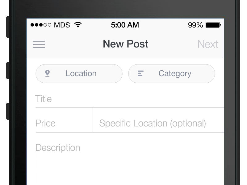
What we liked
- Labels move above the field when the user begins typing.
- Easy to see labels that remain when user begins typing into the field.
Implementation tips: making multi-step forms work for you
Along with following the best practices outlined above, it’s a good idea to monitor the performance of your multi-step form and make changes where necessary. Your respondents will let you know if your form is still too complex or confusing to finish, either by providing feedback or simply not completing your form.
Here are a few ways to be sure your form stays optimized for conversions.
- Continuously test and improve: Keep a close eye on how your form is performing and where respondents get stuck or abandon your form. This will help you determine if you need to make any UX improvements or chances to instructions, error messages, or form fields.
- Add a progress bar: A long form can seem endless if your respondent doesn’t know how long it is or how much time they will need to complete it. Adding a progress bar to your form gives respondents a visual cue that they are moving through the form.
- Use the right form-building tool: Creating your multi-step form will be challenging if you don’t have a user-friendly platform for building. Look for tools that offer no-code, drag-and-drop functionality as well as provide features like save and resume, conditional logic, and custom error messages. Try FormAssembly free for 14 days.
Start building your multi-step form
A multi-step form might seem intimidating to create, but remember how much easier it will be for your respondents to complete. The goal of any form is to get submissions and quality data, so the easier you make the process for users, the better the results you’ll see.
To ensure your multi-step form will convert, be sure to follow best practices for saving and resuming, clear error handling, and constructive form design. Combined, these best practices will keep user engagement high, reduce overwhelm, and most importantly, improve form completion rates.
Not sure where to start? Explore in-depth insights in our Form Building Best Practices Guide or consult with a form-building expert to optimize your specific use case.

