
If you’ve never created a web form before, it can be difficult to know where to start. What should the form look like? How many form fields should it include? What design or content elements will be most engaging for respondents? When you’re just starting out with creating web forms, it’s a good idea to go back to the basics of form building.
In this post, we will walk you through the form-building best practices for creating branded, user-friendly web forms. You’ll learn content, usability, and design tips to inspire better forms that your website visitors will actually want to fill out.
Should you build a web form from scratch or use a template?
In the form builder tool you use, there will likely be several options for how to create a form. If yours is a pretty common type of form (contact forms or order forms for example), you might be able to get away with using a template instead of making a form from scratch.
If you know that you’ll solely be using Salesforce fields and will only need to send information directly to Salesforce (in the case of a web-to-lead form) try using our Salesforce Import Tool that lets you create simple forms based on Salesforce fields.
Constructing the body of your form
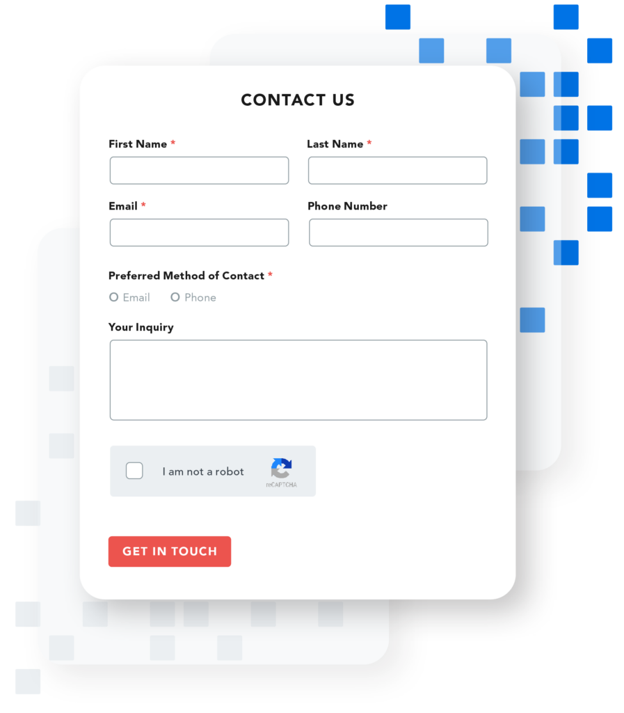
Whatever the purpose of your form, one of the most important things to remember is that you’re using the right field type for each question. Here are a few common field types that FormAssembly’s Form Builder supports:
Question types
- Text entry: Best for short-answer questions and pieces of information like name and email address.
- Text area: Best for essays or long-answer questions. Be careful with these! Too many large text boxes can be taxing on the user
- Checkboxes and radio buttons: Some people confuse these two question types, but here’s the main difference: Multiple checkboxes support one or more selections from a group of options, whereas radio buttons support only one selection. Single checkboxes (think: email opt outs) represent yes/no questions.
- Lists and menus: Use lists and menus when presenting all the options in checkbox or radio button form would clutter the form. Be selective about when you use this question type though, because it can add unnecessary clicks for the user.
- Attachments: Use these if you want your users to be able to upload a document such as a resume, cover letter, screenshot of a support issue, etc.
Number of questions
In addition to choosing the right field types, it is a best practice to keep the number of fields you use to a minimum. You should aim to use just enough fields to get the information that you absolutely need for the specific purpose of your web form.
For example, a simple contact form should include name, email and/or phone, and message fields. It is unnecessary to also ask for an address and credit card information. Any additional information can become a security risk, not to mention make respondents feel wary about why you’re asking irrelevant questions.
Design for your users
When planning how to build a web form, you should always consider User Experience (UX) design. This practice mainly benefits the user by simplifying their experience. Good design also makes your job simpler by reducing errors a respondent might make with confusing design. The following elements in forms can reduce effort for you and your users.
1. Hints and placeholder text
It’s pretty common to see placeholder text designating what information should be entered into a certain field (Name, Email Address, etc.). This practice can help guide your users through a form, but it might not be the best choice for less standard questions.
According to the Nielsen Norman Group, placeholder text can actually work against you if it disappears when your users click on a field. In the event that a user forgets what was supposed to go in a field, they will have to start over. Hints, popup boxes showing how to fill out a field, are often a better option to reduce confusion and extra work.
2. Validations and limits
Validation rules are a great tool if you want users to enter their information in a specific format (using the XXX-XXX-XXXX format for a phone number, for example). You can also set a limit on the amounts that your users can enter in a certain field. These are just a few examples of controls you can place on your forms to standardize the data you receive.
3. Break long forms into multiple pages
With paper forms, you may want to use as few pieces of paper as possible, which often requires cramming an entire form onto one page. With web forms, you don’t have the same space restrictions. It’s actually beneficial for your users if you break up overly long forms into a few pages to reduce the burden of endlessly scrolling and filling out a long form.
4. Use conditional fields to streamline the process for users
Do your users need to fill out every field on your forms? If some questions are optional based on the user’s previous answers, include conditional fields so the questions only appear in certain cases. This makes forms shorter and eliminates unnecessary fields.
5. Make form fields long enough for the expected input
A mistake people sometimes make with their forms is not making the fields long enough for the information people will be most likely to enter. This makes for a clunky user experience. Resize your text boxes or change them into text areas if needed to make sure your user has plenty of space to type their answers.
Learn more form-building best practices in our Ultimate Guide to Web Forms.
Design tips for engaging, user-friendly forms
You don’t have to be a trained designer to learn how to build a web form, but design is an important consideration even for web form beginners. Here are some basic tips for designing your forms:
- Don’t crowd form fields
- Use the same fonts, colors, and images as your overall company branding
- Use fieldsets, groups, and pages to break forms up into manageable sections
- Use repeatable sections and conditionals where possible to decrease form length
- Make forms attractive and easy to understand and fill out
In addition to these, FormAssembly has many different options for ways that you can improve the look of your forms:
1. Add images and text
People respond well to visual information and retain more of it than they do written information. A well-chosen picture can add a lot to your form. It’s also a best practice to add messaging to your web form. Align this content to the messaging of your organization to help your form feel more recognizable and engaging.
2. Use preset themes
If you’re building a donation form, contact form, or any other common and standard type of form, you might want to start with a premade template. This gives you a strong framework that you can build on and customize to meet your needs.
Get more form-building tips
If you found this information helpful, you’ll benefit from learning more about our web form best practices in our eBook, 4 Steps to Better Web Forms.


