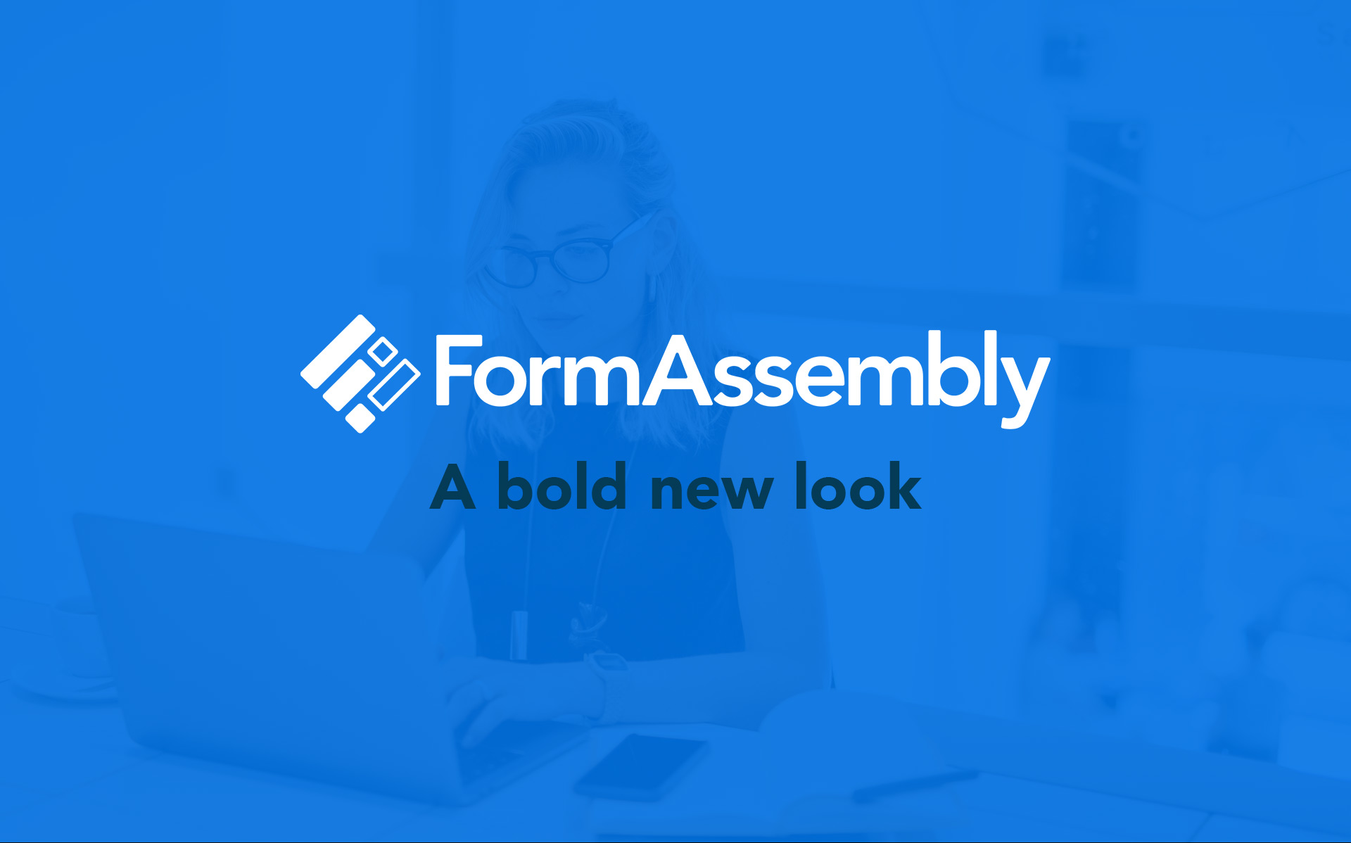
It’s official: You’re looking at the fresh new look of FormAssembly!
For the past year, our company has been working hard to develop a new brand that reflects all that we’ve grown into since our founding. Our new brand has been carefully designed to better represent the powerful, enterprise-level data collection platform that customers know and love. In this blog, we share more about the process, reasons, and goals behind the FormAssembly rebrand.
Our process
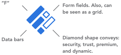
To develop our new brand, our team went back to the beginning, revisited our mission, and put together ideas about how that would translate visually. We did market research to discover new ways to modernize our brand, and we also researched color psychology to create the ideal moods and feelings we want our customers to have about FormAssembly—including security, productivity, and innovation. Hundreds of typefaces were put to the test as we sought after one that was legible and professional, yet friendly. We also created hundreds of logo concepts before we developed the one that visually encapsulated our brand message and vision.
Our goals
Our previous branding lacked enterprise-level focus, had some outdated elements, and our old logo was limited in its uses. When conceptualizing our new brand, we knew we needed it to better communicate our direction and key values, while working well across all customer touchpoints.
Our goal was to create a more modern, long-lasting design that improved the user-friendliness and accessibility of our brand, with a clean typeface and logomark that would be usable in more situations.
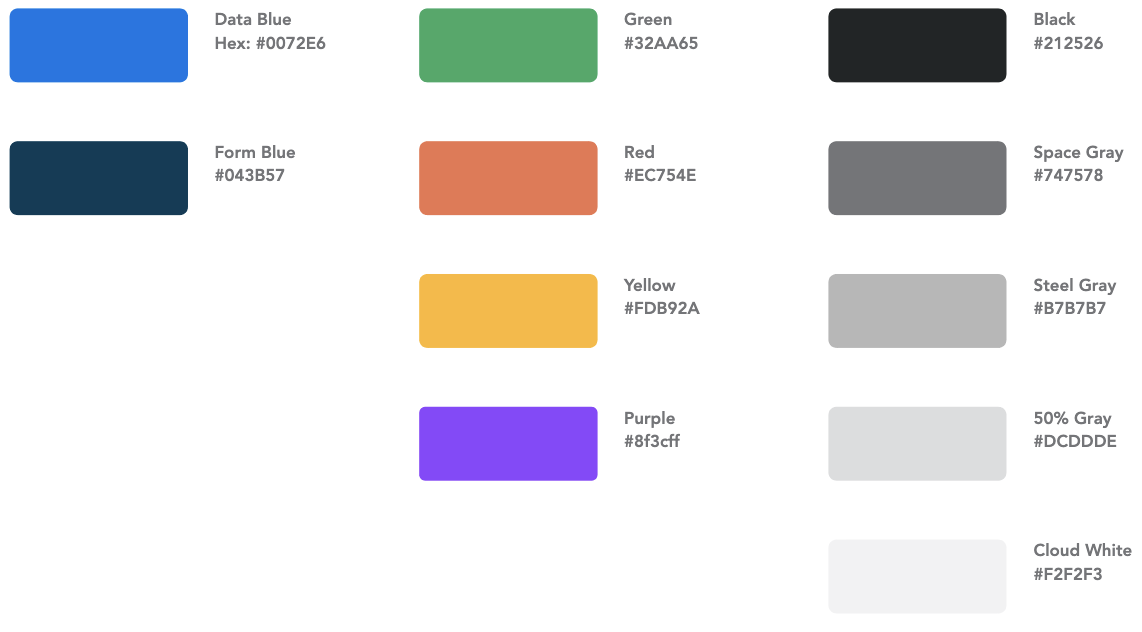
The results
After a lot of time and consideration, we developed a modernized, simplified, elevated representation of our enterprise-level data collection platform. We chose a bold new shade of blue as our dominant color and a simple, yet elegant font to use throughout our branding. Our logo is made up of individual parts that make up a more complex whole to create a strong, recognizable icon that is uniquely FormAssembly. In its entirety, the new FormAssembly brand is a cohesive, dynamic representation of the advanced data collection platform we’ve worked hard to build.